In order to enable persons with visual impairments to move about independently with safety and dignity, Building and Construction Authority (BCA) encourages qualified persons and designers to adopt recommendations on visual contrast in building interiors to help create an inclusive environment.
The orientation and mobility of persons with visual impairments will be greatly enhanced by introducing the concept of:
-
- Visual contrast in building interiors; and
- Detectable warning surfaces.
Visual Contrast in Building Interiors
Vision loss and contrast
Partial loss of vision can make it very difficult to navigate in and around the built environment, especially in unfamiliar settings. While excessive contrast can create problems of glare, inadequate contrast can make it difficult for persons with low vision to discern objects or details in the environment.
Contrast and interior space
Safe and independent use of internal spaces can be greatly enhanced by incorporating effective contrast between building elements, particularly emphasising those elements that need to be identified, operated or interpreted.
Walls and ceilings should be finished in plain colours (not complex patterns, which can be confusing) of light tones (to help diffuse light around the room) and matt finishes (to avoid unwanted glare or reflection).
Floors should also be relatively plain (both to avoid confusion and to allow easy location of dropped objects), not glossy and of a mid-tone to contrast with the walls (for example, when viewed through an open doorway).
Doors should also be of a mid-tone to contrast with walls, whereas skirtings, architraves and door-frames should be of a dark tone to help define surface junctions and openings while contrasting with floors, walls and doors.
Door handles, light-switches, lift buttons, coat hooks and similar elements should all contrast strongly with their backgrounds. This can be achieved either by having a dark element against a light background or by mounting a light-toned operating element on a dark panel, which itself contrasts with a light background.
Soft furnishings (for curtains, chairs, etc.) should contrast with both walls and floors. Introduction of a simple pattern can add life and homeliness to a room but strong patterns can make it difficult to locate spectacles, keys or similar objects placed on the patterned surface.
Types of contrast
Contrast refers to perceptible differences between different regions of an image or scene. There are two fundamental types of contrast:
-
- Luminance or brightness contrast; and
- Colour contrast.
Luminance contrast
Luminance contrast is a measure of the relative amounts of light that are reflected from surfaces. Two quite differently coloured surfaces may have a similar luminance.
A 30% difference in luminance is generally the minimum discernible by a person with partial sight. Black and white have a 100% luminance contrast. Grey and black or grey and white have a 50% luminance contrast, see Figure #1 below.

Colour contrast
Ageing and sight loss diminish the sensitivity of colour perception. Colours that contrast sharply to someone with normal vision may be less distinguishable to a person with low vision.
Colours can contrast on the basis of their lightness, saturation or hue. Designers can help to compensate for vision deficits by making colours differ more dramatically in all three attributes. In this context:
-
- lightness measures the relative amount of light reflected from a colour;
- saturation relates to its intensity; and
- hue refers to elementary colour names, that is, red, green, blue, etc.
Effective design will maximise lightness differences between foreground and background objects, and avoid using colours of similar lightness adjacent to one another, even if they differ in saturation or hue.
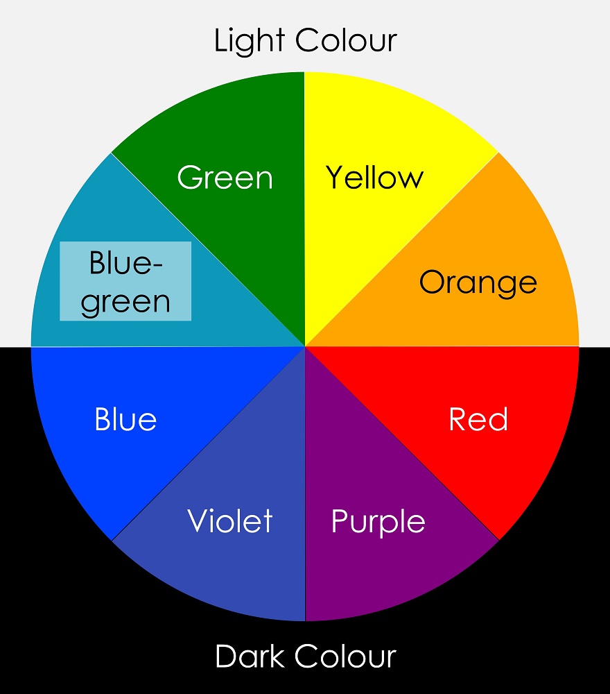
Dark colours from the bottom half of the hue circle contrasts best against light colours from the top half. Avoid viewing light colours from the bottom half against dark colours from the top half, see Figure #2. Lightness is the most important attribute in making contrast more effective.
Avoid contrasting hues from adjacent parts of the hue circle, especially if the colours do not contrast sharply in lightness as shown in Figure #3.
Congenital and acquired colour deficits also make it difficult to discriminate between colours on the basis of saturation. Slate blue, for example, is a desaturated colour because it is similar to grey. A deep blue, even if it has the same lightness as slate blue, has greater saturation as shown in Figure #4.
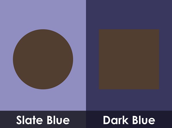
To someone with partial sight, the left-hand panel may appear like the righthand panel appears to a person with normal colour vision.
Glare
Excessive luminance contrast between interior elements can create glare. Windows, light fittings and reflective surfaces can all impact negatively on vision if not designed appropriately.
Direct glare can be minimised by ensuring that strong light sources such as windows and light fittings are effectively screened. Reflected glare can be reduced by eliminating reflective surfaces, especially on floors and walls, and by attention to the location of light sources relative to mirrors, glazing and the like.
Lighting
Contrast will only be of assistance to people with sight deficits if there is an appropriate quantity and quality of illumination with which to view the contrasting elements. At low light levels, the perception of contrast diminishes.
Lighting levels should generally be relatively uniform and about 25% higher for people with low vision. Strong directional lighting casts shadows that can mask contrasting surfaces. Significant fluctuations in illumination level can reduce visibility due to the slower adaptive response of the eye in someone with low vision.
Detectable Warning Surfaces
Mobility
People who are blind or visually impaired strive to maintain the highest possible level of independence. Many people who are blind have a small amount of residual vision and all people with visual impairments will use whatever vision they have, together with other techniques, to find their way around.
Some individuals will choose to travel with a sighted guide while others will choose to travel independently. For those who choose to travel independently, continual and extensive use is made of physical or other sensory cues, landmarks and mind maps.