Certain colours are easily perceived by the elderly and some do the exact opposite.
Colours and patterns that cause confusion to the elderly should be avoided to create an age-friendly environment. They are:
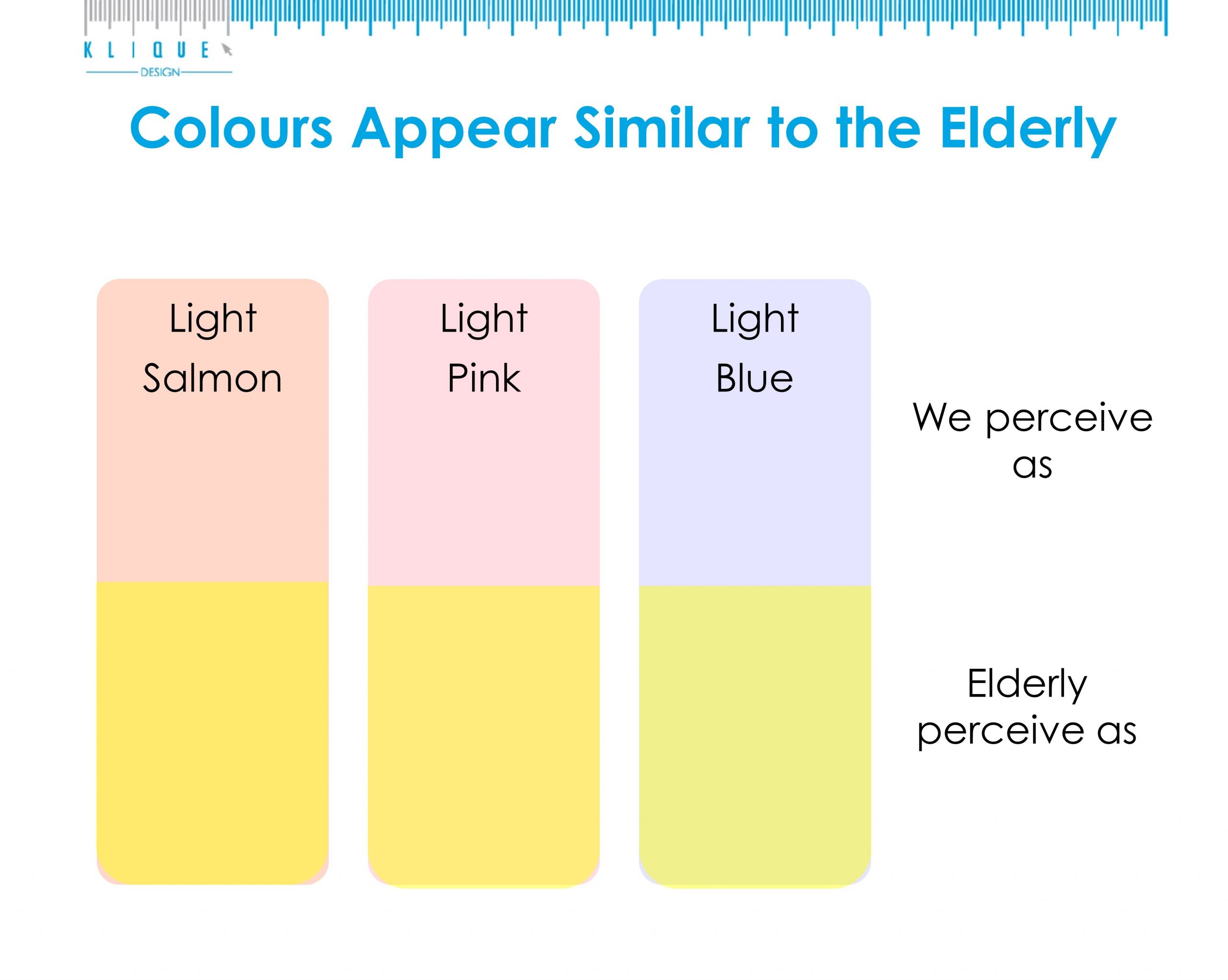
1. Colours such as light salmon, pink and blue that appear similar. The reason is that of the yellowing of an elderly’s eye lens.
2. Lavender that appears muddy.
3. Purple that may appear as brown.
4. Purple and violet used in large area. These 2 colours can cast a yellow-green pallor on afterimage.
5. Yellow. It can decrease motor ability and increase shaking for people with palsy.
6. Bold patterns and small motifs.
Source: SingHealth