 Appropriate use of colours can uplift the look and feel of a place. And careful selection of colours in a built environment can have a glare-reduction effect and improve the ability of users especially those who are visually impaired to move around the building.
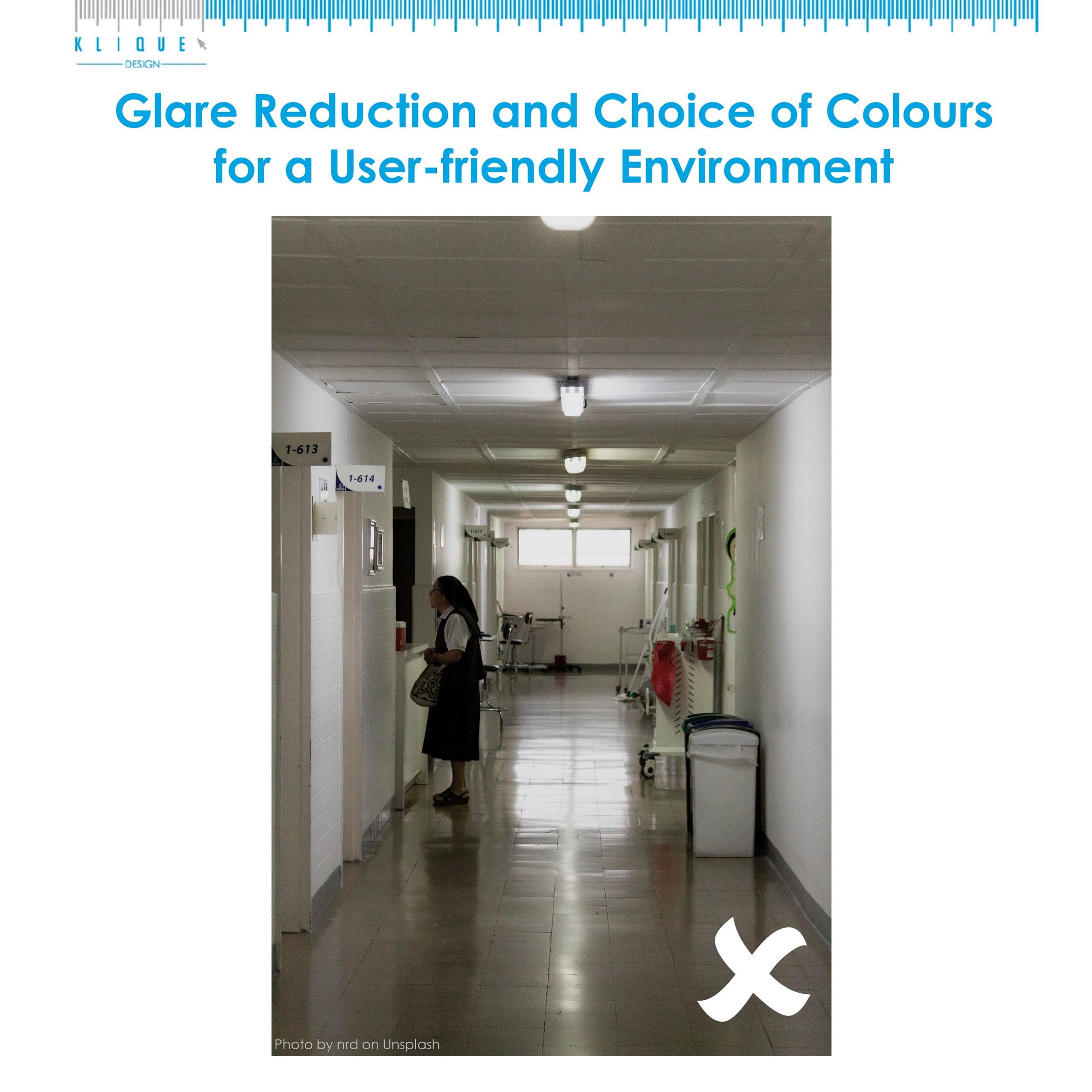
The picture above shows a poorly contrasted wall-floor colour. The floor also creates glare which is hard for people to see clearly. With glare reduction measures and right choice of colours listed below, we can enhance the accessibility of a premises.
1. Use glare-reducing treatments on exterior facing windows and all glass walls.
2. Remove, reduce or relocate materials or light sources that cause glare.
3. Use non-glare flooring materials throughout the building.
4. Use non-glare materials over wall hanging pictures and signage.
5. Filter natural daylight penetrating interior spaces to reduce direct glare.
6. Use contrasting colours between the wall-floor and floor-furniture.
7. Colours that contain a greater amount of white will reflect more light.
8. Use matter finishes in pale colours on horizontal surfaces to reduce indirect glare and enhance brightness by adding sheen.
Source: SingHealth
